Nov 30, 2023
Strategies you can steal from the portfolio of the year

Creator of Dive

Product designer at Figma
It's mid-2022 and Marco Cornacchia is coming off a failed startup with limited work to show and no job leads...
Here's what happened next 👇
The one and only Jordan Singer slid into his DMs asking if he wanted to lead design at his new startup
He broke Twitter with the new Diagram.com and pioneered the animated bento grid design trend
Figma acquired his startup and announced AI as the next chapter in design
Webflow asked him to give a talk at their annual conference
We featured his story in this week's Deep Dive 😉
So how the heck did he do it??
Well... I think you can argue that Marco Cornacchia created the most impactful portfolio of the last year 👀
It's easy to point at his website and say:
"ya well that's only because he knows how to build animations like that in Webflow!!"
I disagree.
Marco used 3 tactics that anyone can use to level up their portfolio (even without custom animations)👇
1 — Ditch the portfolio grid
You've seen this design portfolio structure 1,000+ times by now...
Here's why it sets you up for failure 👇
When you use a portfolio grid structure you're forced to boil an entire project's worth of compelling work into a single thumbnail image 🙄
That means the majority of hiring managers only see that one image (b/c let's face it, a small percentage of people actually read your case studies).
"ya but didn't Marco still use a portfolio grid?"
I'm glad you asked! On the surface it may look the same but there's one important difference...
Marco created multiple entry points to the same case study as a way to showcase all of his best UI directly on his home page 💡
If Marco would've used the standard template he'd only have four thumbnails on his home page!
Instead... he turned his four projects into 8 cards that perfectly showcase his skills 💪
2 — Tell your story on the home page
Too many designers focus solely on telling isolated project stories that they forget to craft their own compelling narrative.
That's why I love how Marco includes these three cards in his main layout 👇
Be careful though...
If you're going to share your life outside of design then you need to nail the hierarchy.
Make it easy to skim and use the space as an opportunity to demonstrate your understanding of typography, layout, etc.
The way Marco formatted the paragraph on the left is very intentional (notice how I'm using the same tactic in this email) 👀
Although if Marco really wants to take this component of his portfolio to the next level...
Adrien from Linear might suggest adding a personal video 😉
3 — Order your content correctly
As a hiring manager, I have a few basic questions that I want you to answer immediately when I click into a portfolio:
What is this?
Why did it matter?
What was your role?
That's why I love how Marco leads all of his case studies with a simple summary section that frames the rest of the page 👇
But the mistake most designers make from here is they go directly into step one of their design process 🤦♂️
Remember... you have to continually sell people on the idea that they should stick around and read what you have to say.
So you have to hook them (and quickly).
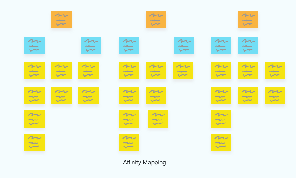
Dumping a hiring manager into an affinity map of sticky notes is the fastest way to get someone to bounce 😬
So what does Marco do instead?
Once the stage has been set, the first thing he presents is the sexiest UI he designed during the project 👇
Now as the hiring manager I think "ok this is nice... I wonder how he got here?"
You have them hooked 🪝
Get the full story
If you want to go even deeper then you're going to love this week's episode with Marco Cornacchia.
Here's a little taste of what's inside:
How being a 2x founding designer has forced him to grow quickly
How he convinced Jordan to let him build the Diagram website entirely in Webflow
What it's like designing for AI tools
His transition from startups to being at a $10B company like Figma
When you shouldn't use an animated bento grid
His journey as a self-taught designer
Listen on YouTube, Spotify, iTunes, or wherever you get your podcasts 👇
Go deeper…


hello@dive.club
Ⓒ Dive 2026